Hall Neighborhood House
Challenge
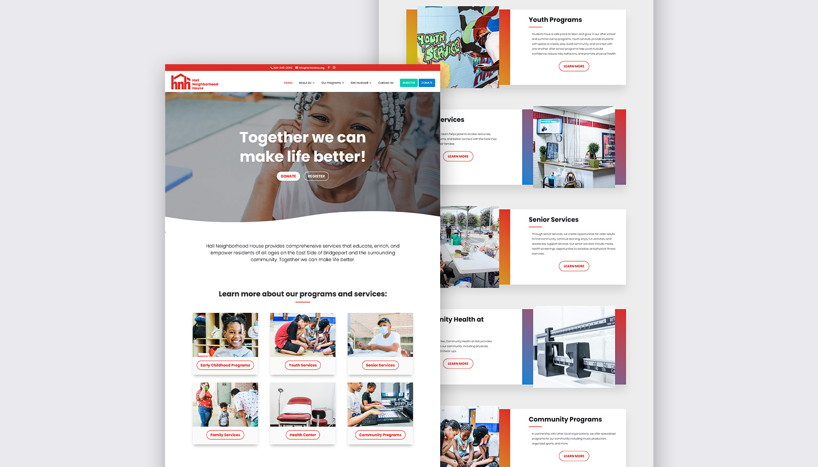
Hall Neighborhood House wanted to preserve the equity of its existing brand but needed to bring it up to date with a more contemporary look and feel. They offer programs for everyone, including childcare and preschool for infants, after-school programs and summer camp for youth, and daily activities for seniors. Their target demographic was location-specific but diverse in age, gender, and ethnicity.
My Contribution
- Brand Development
- Brand Identity
- Website
- Campaign Creation
- Digital & Print Design
Process
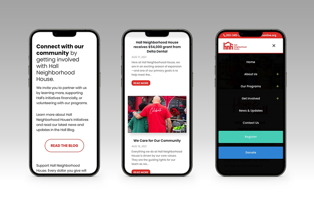
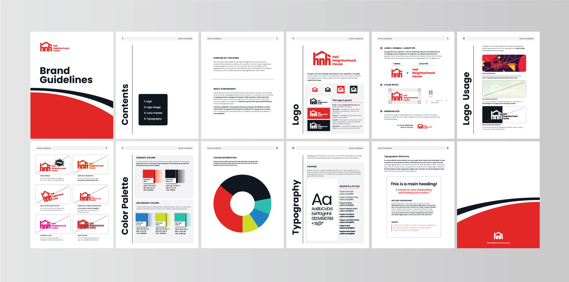
I started the rebranding process by selecting a new typeface. Working together with Hall’s key stakeholders, we landed on the modern sans serif Poppins. It is a geometric typeface that has a lot of balance and approachability. It has high readability and is great for both paragraph copy and headlines. Its versatility makes it appropriate for all ages.
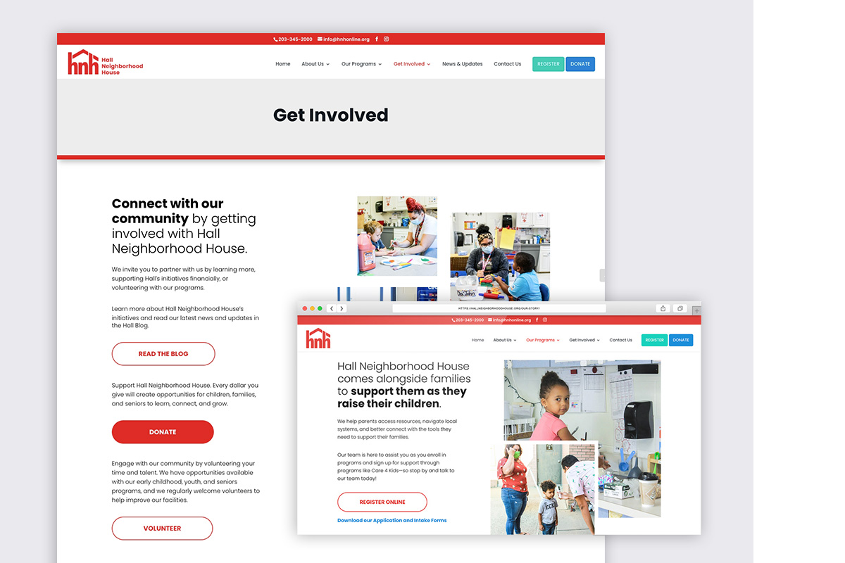
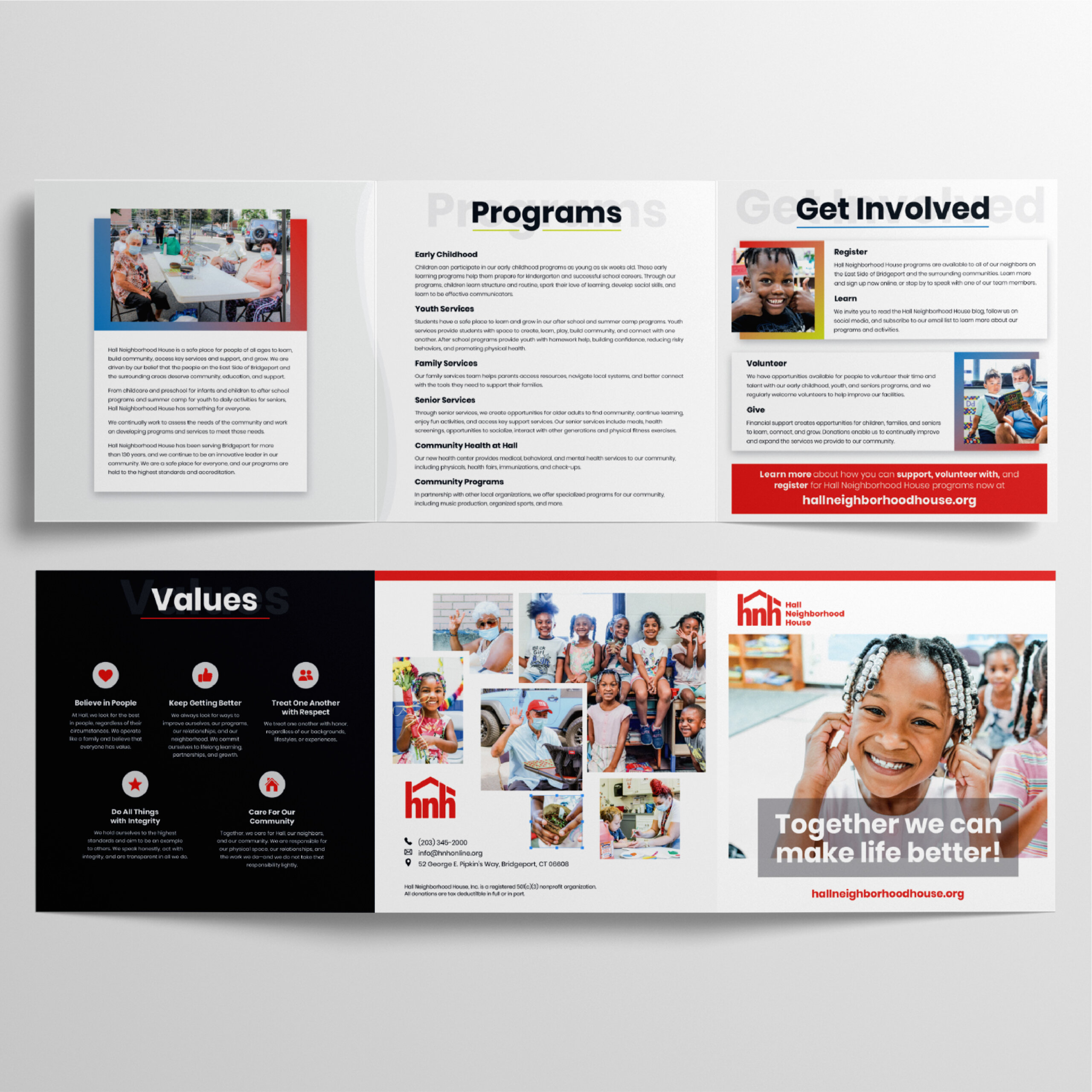
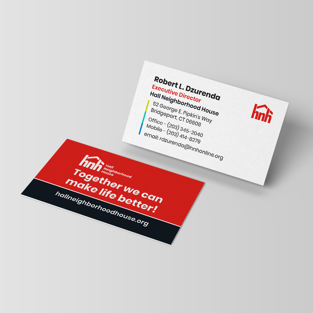
The new color palette is vibrant and youthful, which makes the brand exciting and fun. The re-established marketing direction, in both print and digital collateral, is clean and uncluttered. It uses authentic photo-journalistic images that promote community awareness and involvement.
Results
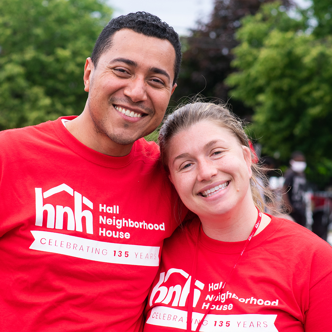
The rebrand was prominently on display at Hall’s 135th-anniversary celebration event. The community embraced the new look with open arms. The logo and color palette are prominently displayed on their website and are used in all print and digital collateral.
Related Projects

Diversifly
Hands Offering Hope

