by patrickfisher@icloud.com | Feb 13, 2021
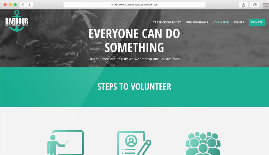
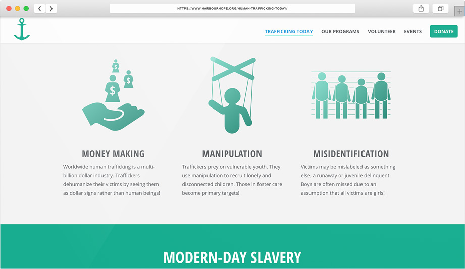
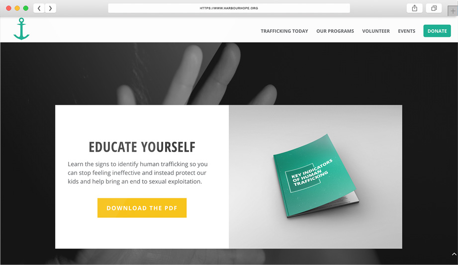
HARBOUR HOPE INTERNATIONAL
Harbour Hope International is a nonprofit organization dedicated to ending human trafficking by providing mentoring relationships to survivors of sex trafficking on their journey toward self-sustainability.
Harbour Hope International (HHI) wanted their brand to communicate strength in the midsts of chaos. In addition to their brand identity, the organization also requested a website and print collateral.
The logo, typography, and color palette were chosen by taking inspiration from the name of the organization and the job of an anchor, which is to keep boats secure in the waves of the sea.
I also created a vibrant and user-friendly website for HHI that includes organizational information as well as a donation form for supporters. In addition, I created print collateral; business cards, direct mail pieces, and branded training material.
by patrickfisher@icloud.com | Feb 19, 2021
Signal 20 is an automotive detailing business owned and operated by a local sheriff deputy.
The owner of Signal 20 requested a captivating brand identity during the start-up of his business. He wanted to tie the brand’s identity to his passion for fighting crime.
I designed a clean logo that incorporates the sheriff badge icon and utilizes a classic law-enforcement color palette. Along with the Signal 20 logo, brand guide, and other corporate and marketing collateral, I designed a variety of apparel items and social media graphics.
by patrickfisher@icloud.com | Feb 27, 2021
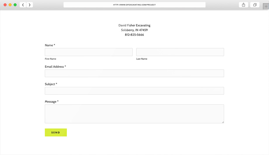
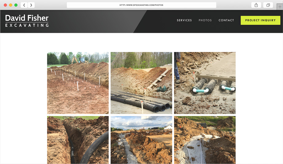
David Fisher is a local excavating professional who has served the southern-Indiana area for 30+ years.
David was looking to establish his brand identity and expand his digital presence. I created a clean logo and chose a color palette that would resonate with his target audience. I also setup a user-friendly website that helped increase his number of job leads and referrals. You can see his brand at work in his business cards, vehicle lettering, apparel, and promotional items.
by patrickfisher@icloud.com | Feb 15, 2021
Canopy Insurance Agency is a trusted Florida insurance agency who has served the Space Coast community for over 30 years.
With a change in agency management, owner, Tammy was looking for a brand refresh. In addition to cleaning up the Canopy logo, I created corporate collateral, including business cards, roadside signage, and monument building signage.
by patrickfisher@icloud.com | Feb 15, 2021
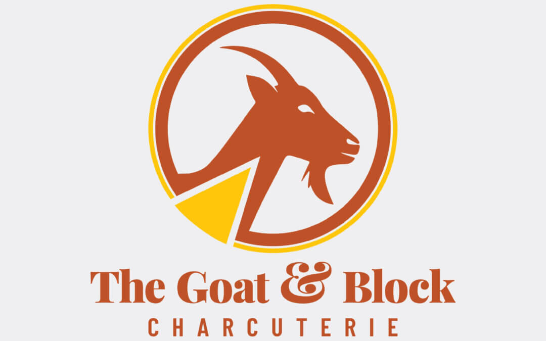
THE GOAT & BLOCK CHARCUTERIE
The Goat and Block is a premium caterering business that focuses on creating visually and tastefully balanced charcuterie boards.
Owner, Sarah, wanted to include both “goat” and “cheese” elements in a logo for her start-up catering business.
Along with creating a new brand identity that Sarah is proud to show off, I included a simple brand guide that provides instructions and usage guidelines for the Goat & Block brand. The guide is important so that the brand’s look and feel maintain consistency on all future marketing materials.


-")


Recent Comments